Builder Profile

Role
I was the sole designer who defined missing edge cases and led the responsive UI design for both desktop and mobile experiences

Outcome
10,000
weekly views across our feature
300+
increase in subscriptions

Background

Subcontractors (builders, plumbers etc) had no way of viewing their past tendering history with builders. Without this, they couldn't tell whether a working relationship was worth pursuing, or whether their bids were landing at all.

Estimate1 identified this as an opportunity to build a new Builder Profile experience where subcontractors could unlock by upgrading to a higher subscription tier to view their history with a builder and actively browse open work opportunities.

Design was a blocker

When I joined, the product and engineering teams had already been scoping this feature for 6 months with no designer embedded. Without one, the feature had been stuck in limbo and the team were at risk of missing their OKR to launch.

To help reduce this roadblock, I ensured that I was catching up almost daily with the product manager to gain more context and shared ideas regularly with developers and product managers at our stand ups. Sharing my work at these sessions meant the team was getting clarity on how the design was shaping up and reducing ambiguity on what the final design would look like.

Without these regular sessions, developers would have been unable to technically scope the work and risk being delayed further.

Pushing for a mobile UI 

Our analytics showed a significant portion of our users were on the go and were using our product on mobile as much as desktop.

The initial plan was desktop only which would mean missing half the opportunity to drive subscription upgrades.  I made the case to the team that mobile shouldn't be a fast follow-up - it needed to ship alongside desktop to help drive up subscriptions.

In the end, both experiences launched simultaneously, giving sub-contractors a consistent way to engage and upgrade regardless of device. If we didn't make our design a responsive experience, then we'd risk losing out on potential subscription upgrades on mobile because users had a bad first experience

Building a new responsive table

Our default table components weren't designed for mobile. They were non responsive and required users to scroll inside rows hindering the users view.


To create a more optimal experience, I designed a simple new table component that works on both desktop and mobile. The new table design was well received by designers internally as a quick solution to help unblock the team.


If we didn't make our table a responsive experience, we would have had to give users a scrolling table view that would have been much harder to read and risk giving a disappointing visual experience.

Outcome

10,000
weekly views across our feature
300+
increase in subscriptions
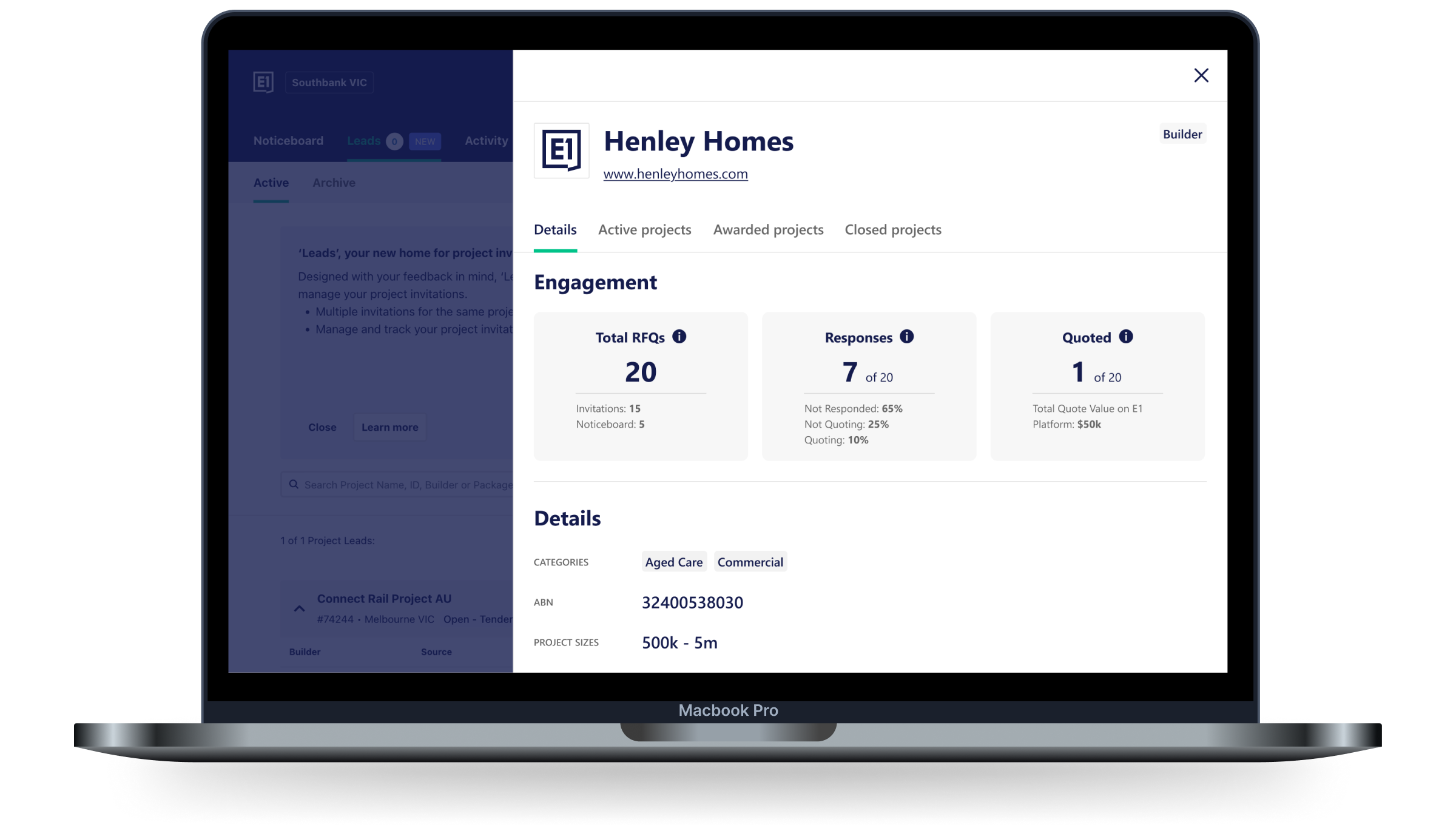
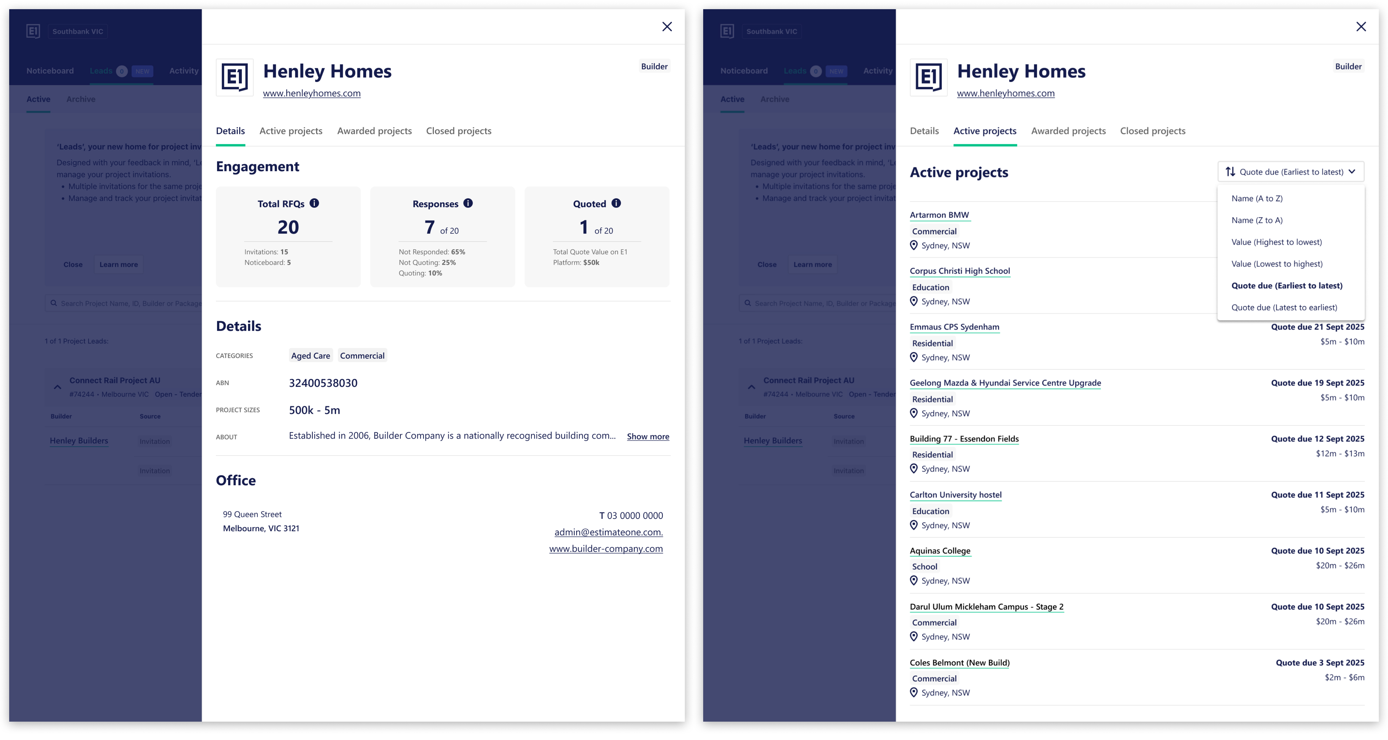
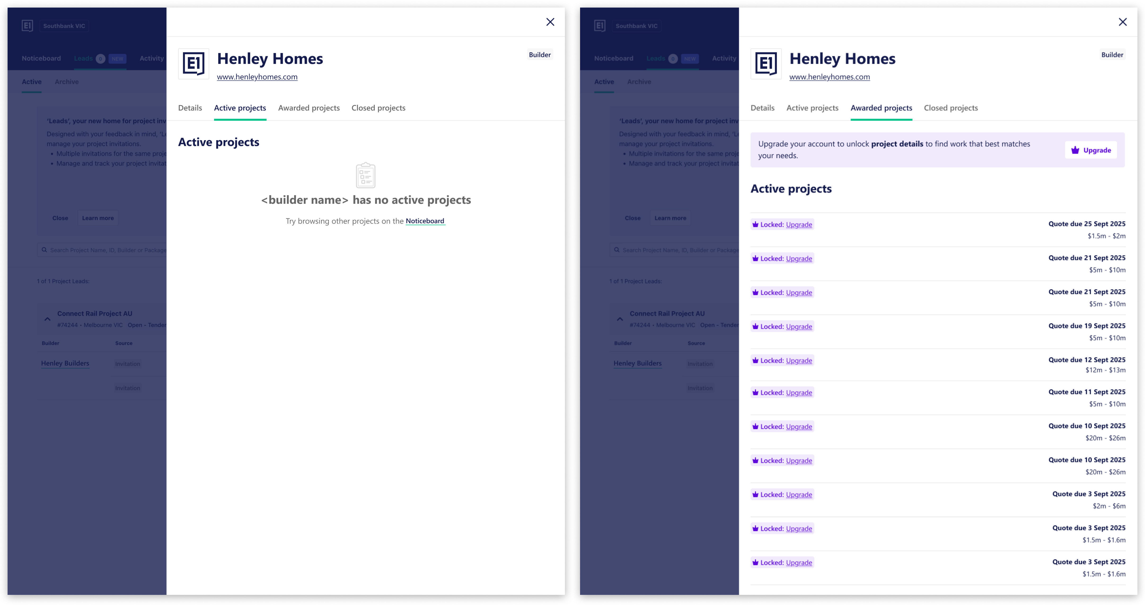
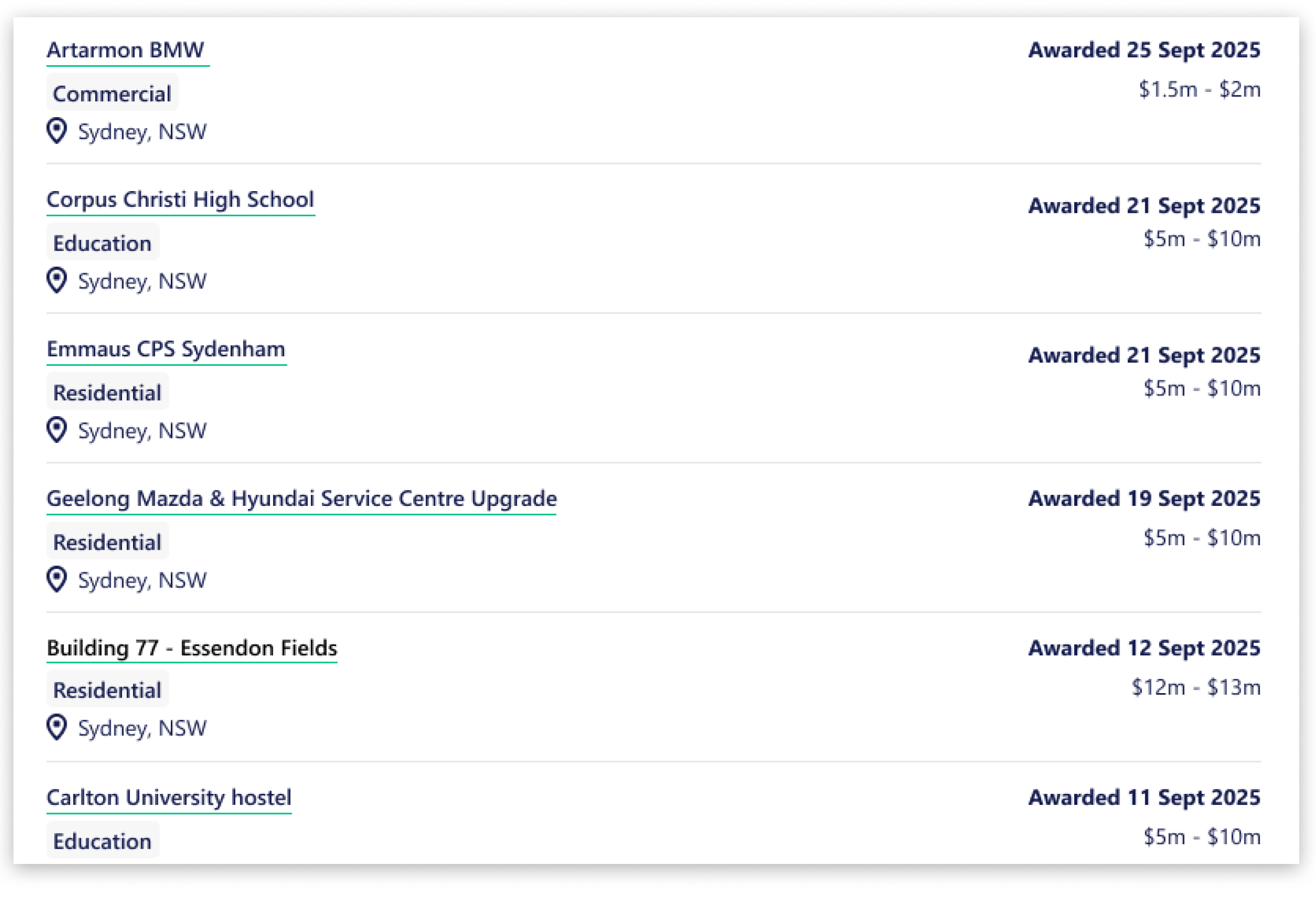
The feature launched on schedule by October 2025 and met the team's OKRs. The Builder Profile quickly reached 10,000+ weekly views and drove 300+ new subscription upgrades through the paywall experience.

The design work was also commended by other team members for going forward with a mobile state as many features in Estimate1 were not responsive.
© Michael Szeto | Melbourne, Australia
View case study