Timely Cardless Checkout

Role
Lead product designer — I led the end to end design process from research to final UI handover

Outcome
$1.7M
in sales transactions by July 2021
22%
of Timely's revenue by July 2021

Background

Timely’s payment gateway didn't support saved payment methods. Every payment processed outside Timely was revenue the business was missing out on.

I was the lead designer in the team to deliver an experience that reduces checkout time and increases revenue for users and Timely.

Discovery with customers

I conducted on-site customer visits and online interviews alongside my product manager to validate the opportunity before designing anything.

Key findings that shaped our design were
Customers wanted client consent before storing card details to protect themselves legally. We applied this directly to the client booking experience by asking clients to give consent
Customers preferred clients adding card details before their appointment for faster checkout. In the client experience, we enforced card capture at the booking stage rather than at point of sale.
Smaller businesses expressed interest in an iOS solution as this was their primary method using Timely. We made separate plans to build out the iOS experience in our roadmap.
Without these visits we would have been designing blind, but the learnings here gave us the confidence to move forward knowing this was a problem worth solving.

Ideation and User testing learnings

I led a co-design workshop with engineers and my product manager, generating a range of ideas where our design could sit in the product ecosystem. We dot voted to prioritise the strongest concepts and took these into a prototype that we tested with 8 participants in New Zealand, Australia and the United Kingdom.

Key findings that shaped our designs were
The feature's original name "Card Capture" was confusing and participants couldn't tell what the feature did by the name. We renamed the feature Cardless Checkout to clearly describe the feature
Participants wanted a way to save card details for clients without an existing booking so they had payment details ready for the future. We added this experience to our upcoming roadmap to avoid scope creep
Customers wanted information on how to refund a stored card for unnecessary payments. We addressed this through help documentation to keep the UI clean.

Without user testing, we would not have learned these key updates we needed to improve on such as our confusing feature name and how to build trust with users better.


Our process and shareback was so well received the head of design requested we share how our process worked to upskill other designers  to run their own user testing.
“ It makes sense. It fits in with everything else you do as far as taking payments is concerned ”
- Beauty Owner feedback from user testing

Mapping out the different userflows

As our experience would touch a significant number of touchpoints in the product, I mapped out the edge cases and flows for the core 3 areas we identified in our co-design workshop which were Settings, Client booking and Checkout.

Without having these 3 separate flows mapped, we would have had no shared reference point on where our experience sits, making design and engineering alignment more challenging.

Building trust for clients

For the client experience, we needed to build clients trust that entering credit card details for this feature was safe and secure.

My product manager and I researched competitor payment solutions like Stripe, Square, and PayPal and identified that users felt more comfortable paying online when they could see logos of trusted card payment providers that they knew.

Even though adding these logos increased visual clutter in the disclaimer, we made the deliberate call to include them as user testing had identified trust as the primary barrier stopping clients from completing card entry.

The biggest challenge for the checkout experience

A separate team was redesigning the checkout UI in parallel which created a risk that our work would conflict with theirs and delay our launch.

To keep both teams aligned, I set up weekly syncs to go over any UI changes that had come up from the other team since we last checked in and how these could impact our feature and vice versa. While adding extra weekly meetings takes time in a busy week, these sessions were successful in helping our teams stay across each other's work and allowed us to provide regular feedback on UI consistency.

Without these regular check-ins, we would have risked handing over to development misaligned with the updated UI, delaying our launch and impacting the quality of what shipped.

Outcome

$1,765,739
in sales transactions by July 2021
22%
of Timely's revenue by July 2021
The success of TimelyPay led the business to create a second team and double down on exploring new payment opportunities further to increase revenue and value for both users and the business.

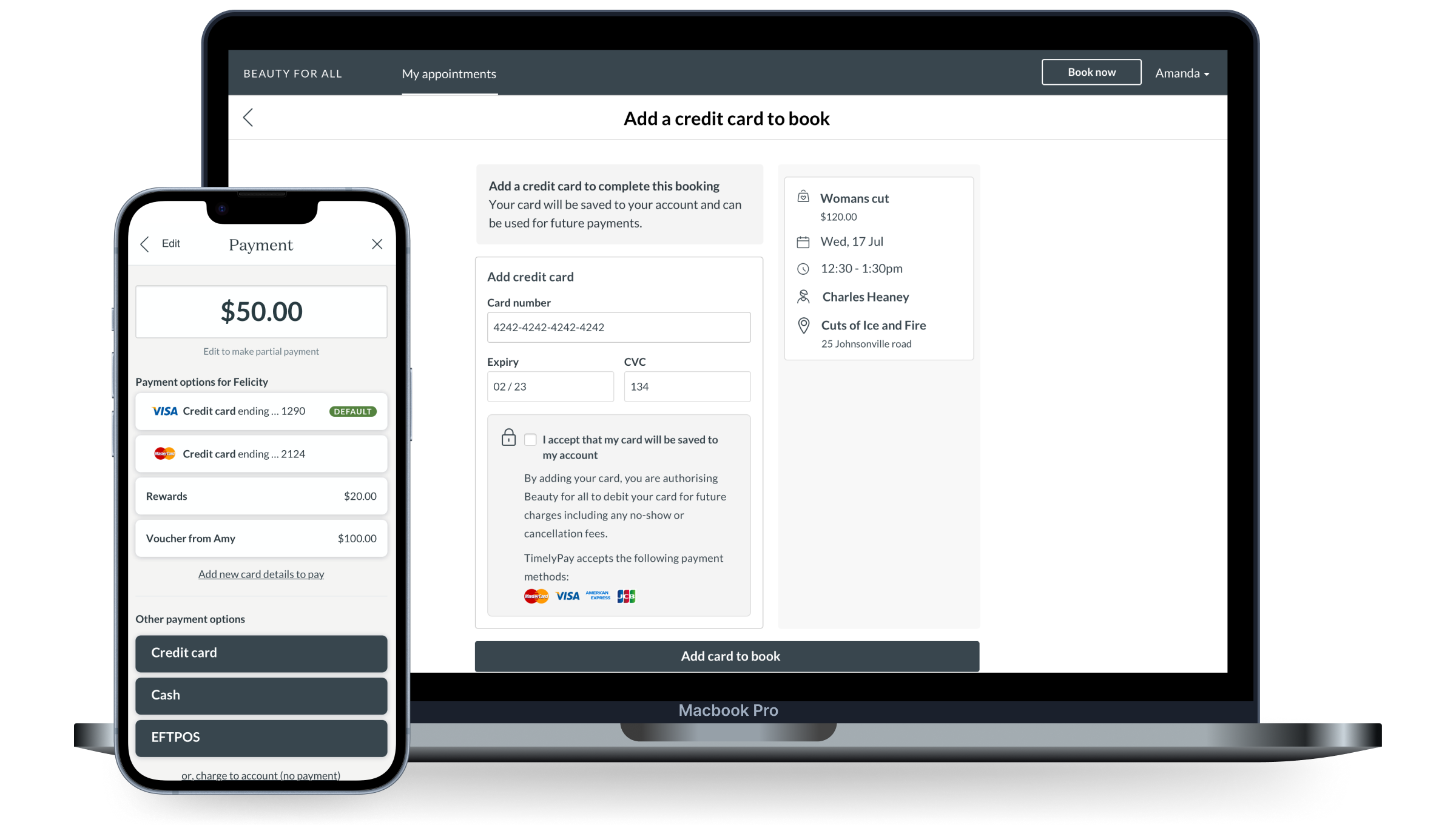
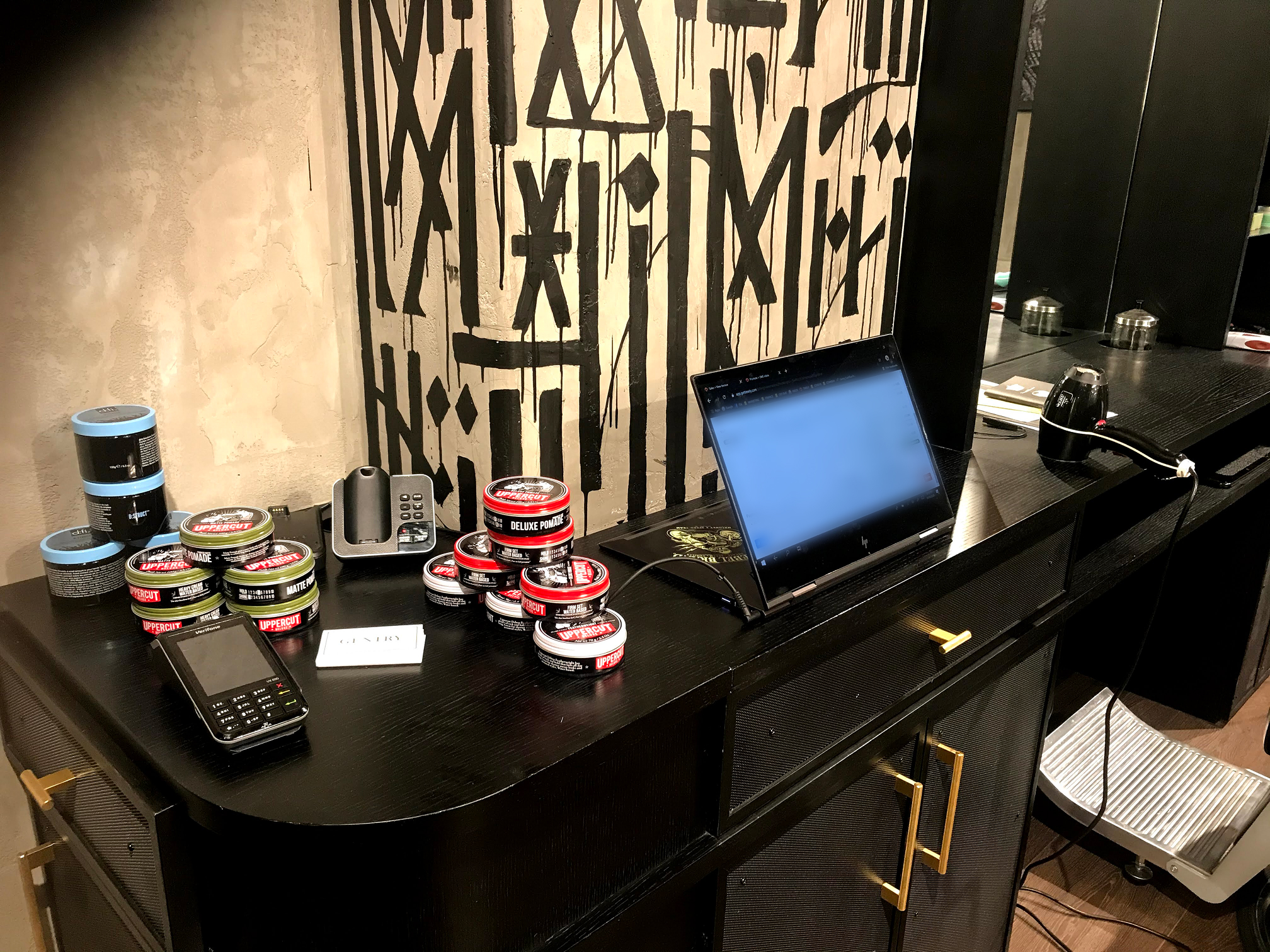
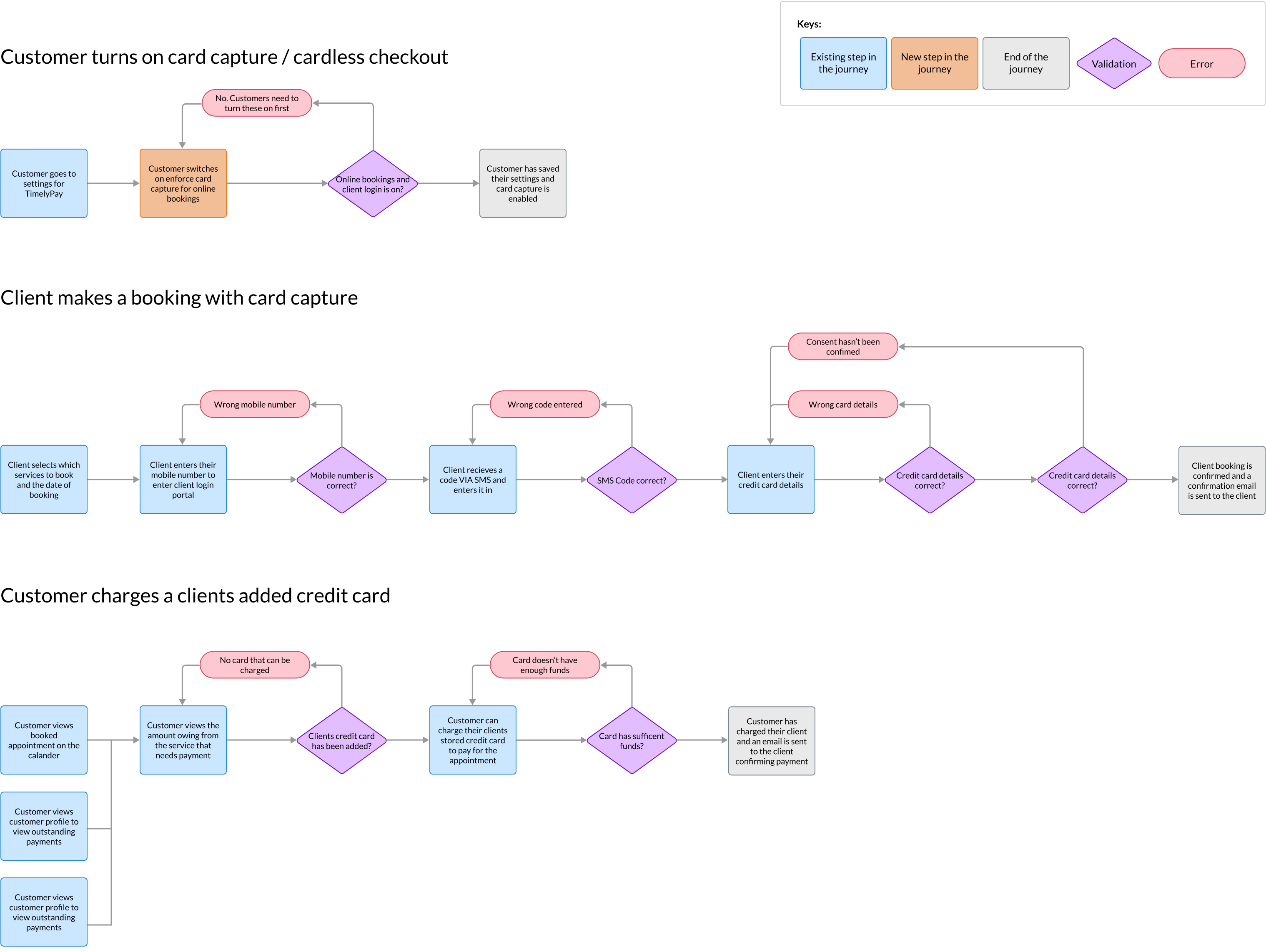
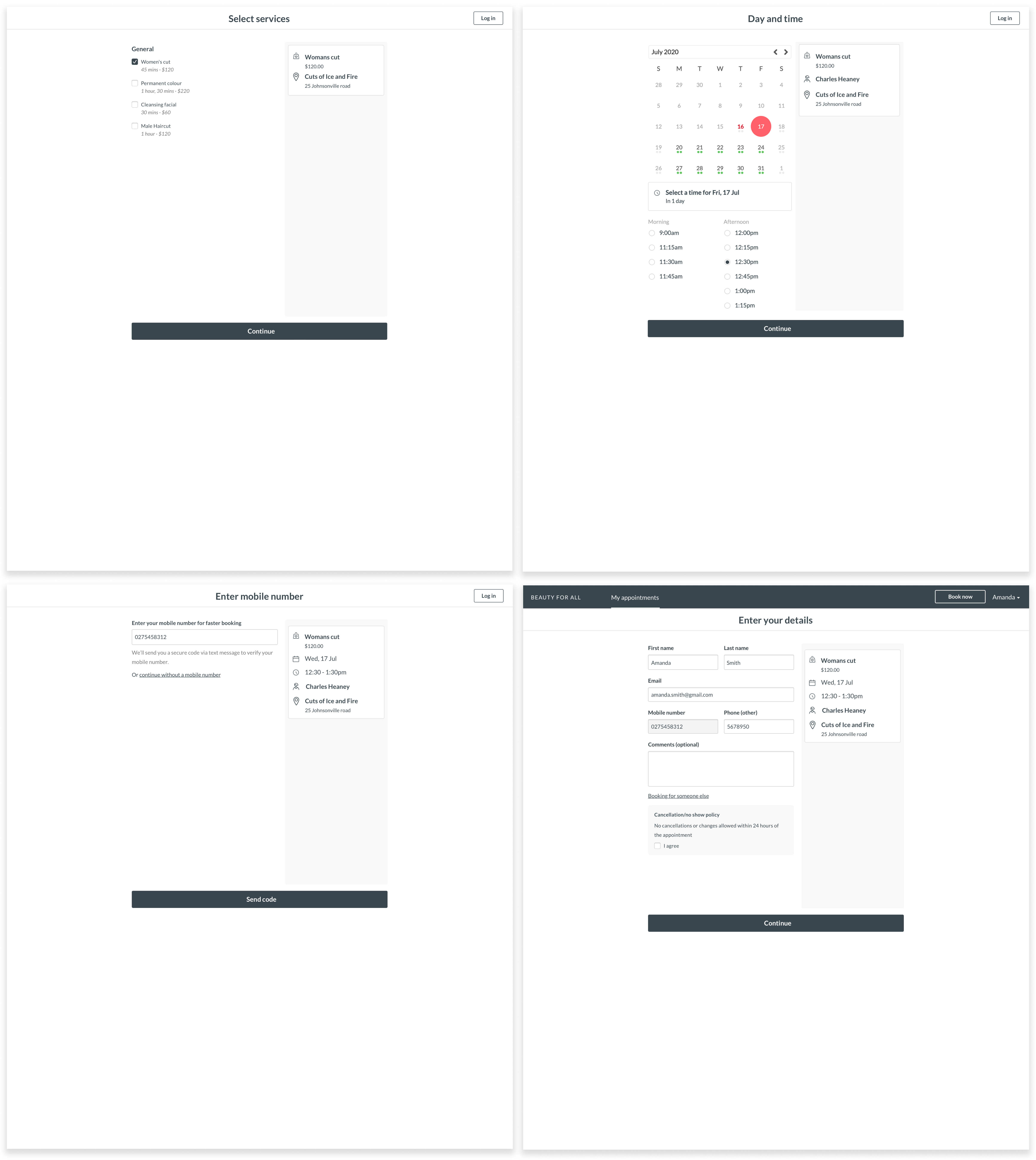
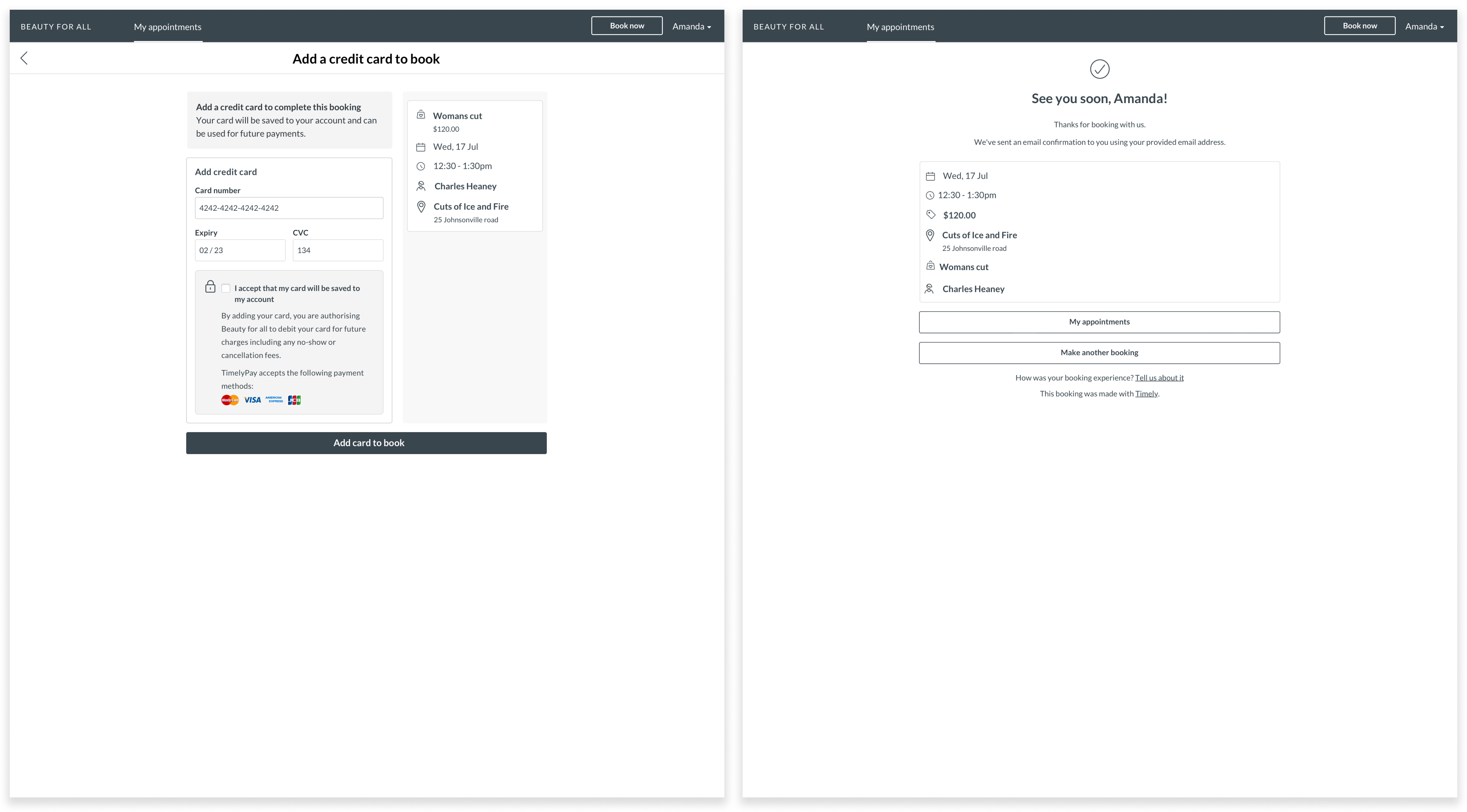
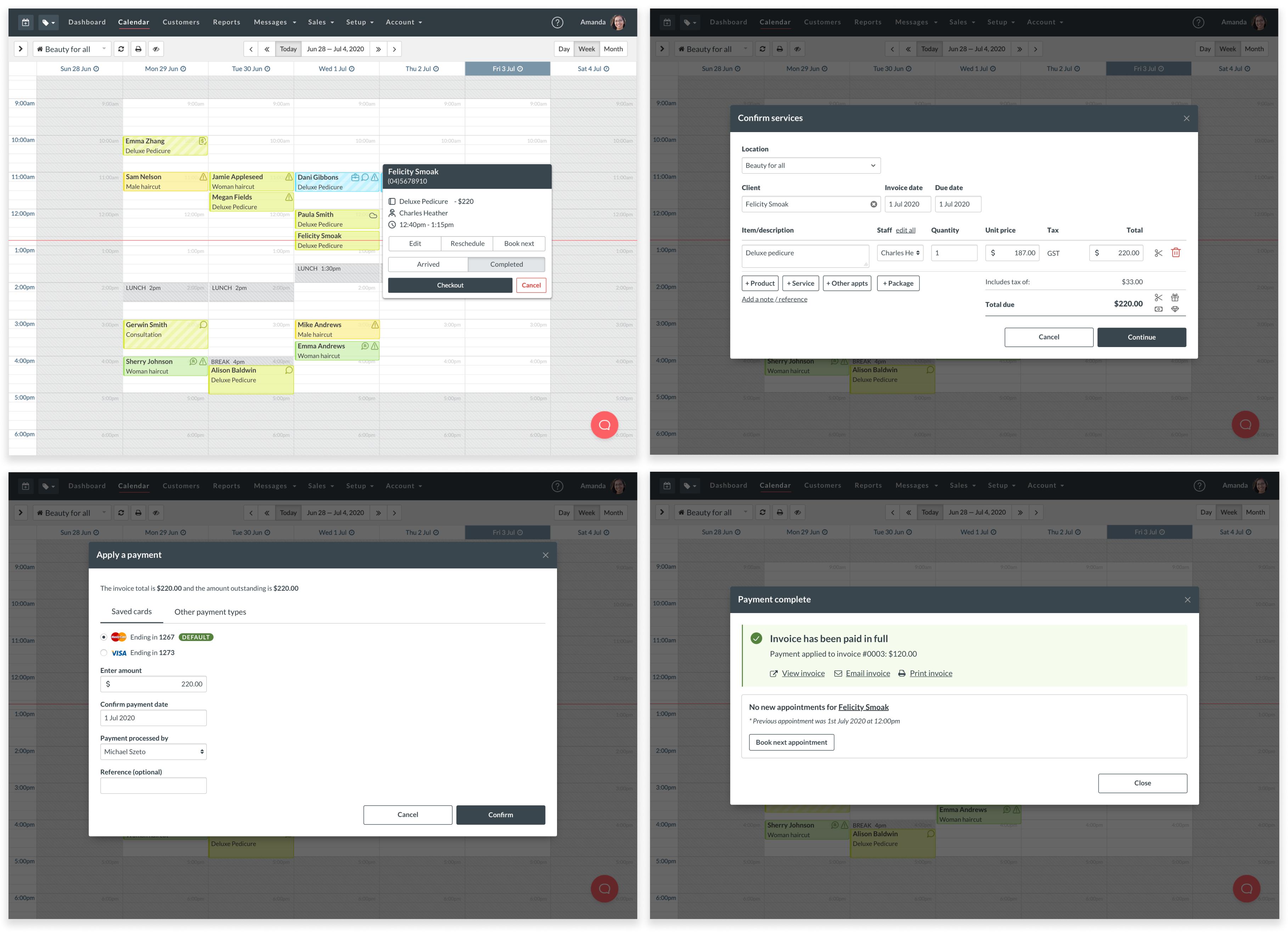
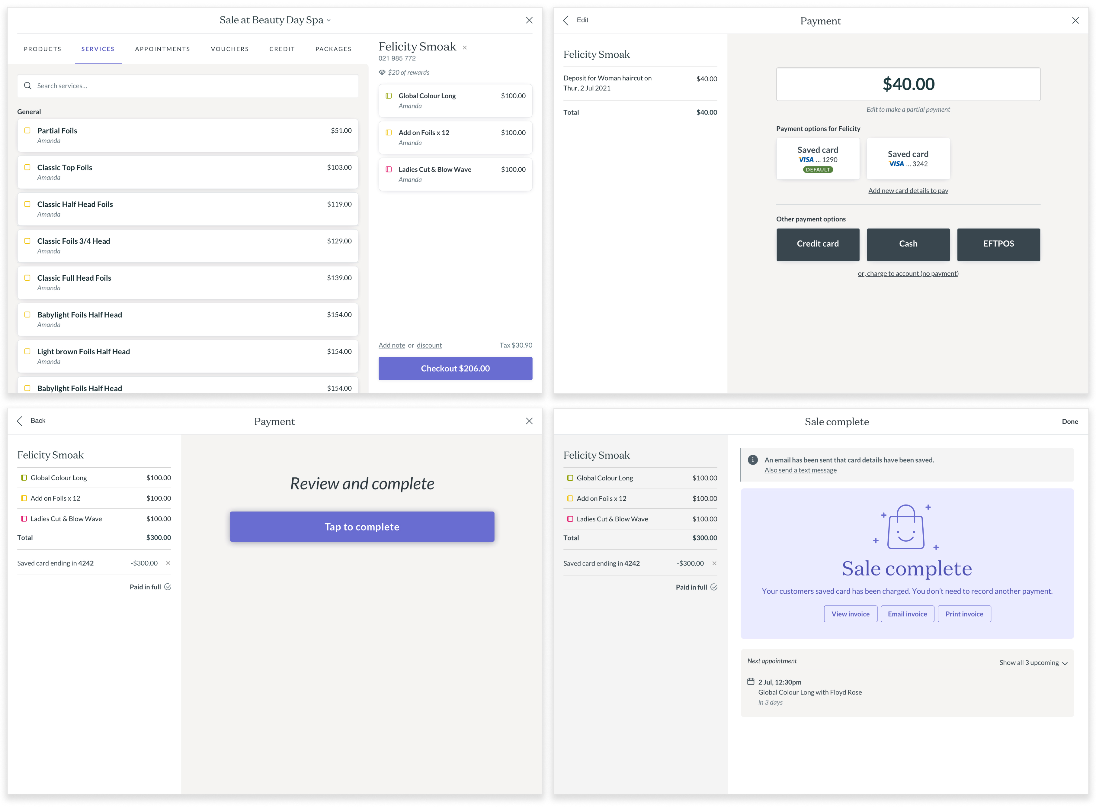
After our launch in October 2020, we built out an additional new experience to allow beauty businesses to save credit cards at the front of counter and built the experience for our iPad app too.

In its first 3 months, we recieved positive feedback from salon owners that the feature was a positive investment that helped their businesses.
“ LovingCardless Checkout!! Best thing ever!! Clients have found it really easy to add cards and checkout has been seamless!!  ”
- Beauty business feedback on Cardless Checkout
© Michael Szeto | Melbourne, Australia
View case study