Role I led the design work for our new userflow, co-design workshop, prototyping to final UI. I collaborated closely with a design researcher during testing, observing sessions and translating findings into design decisions.
Outcome
150,000+
tax statements generated
30%
increase in feature usage
Background
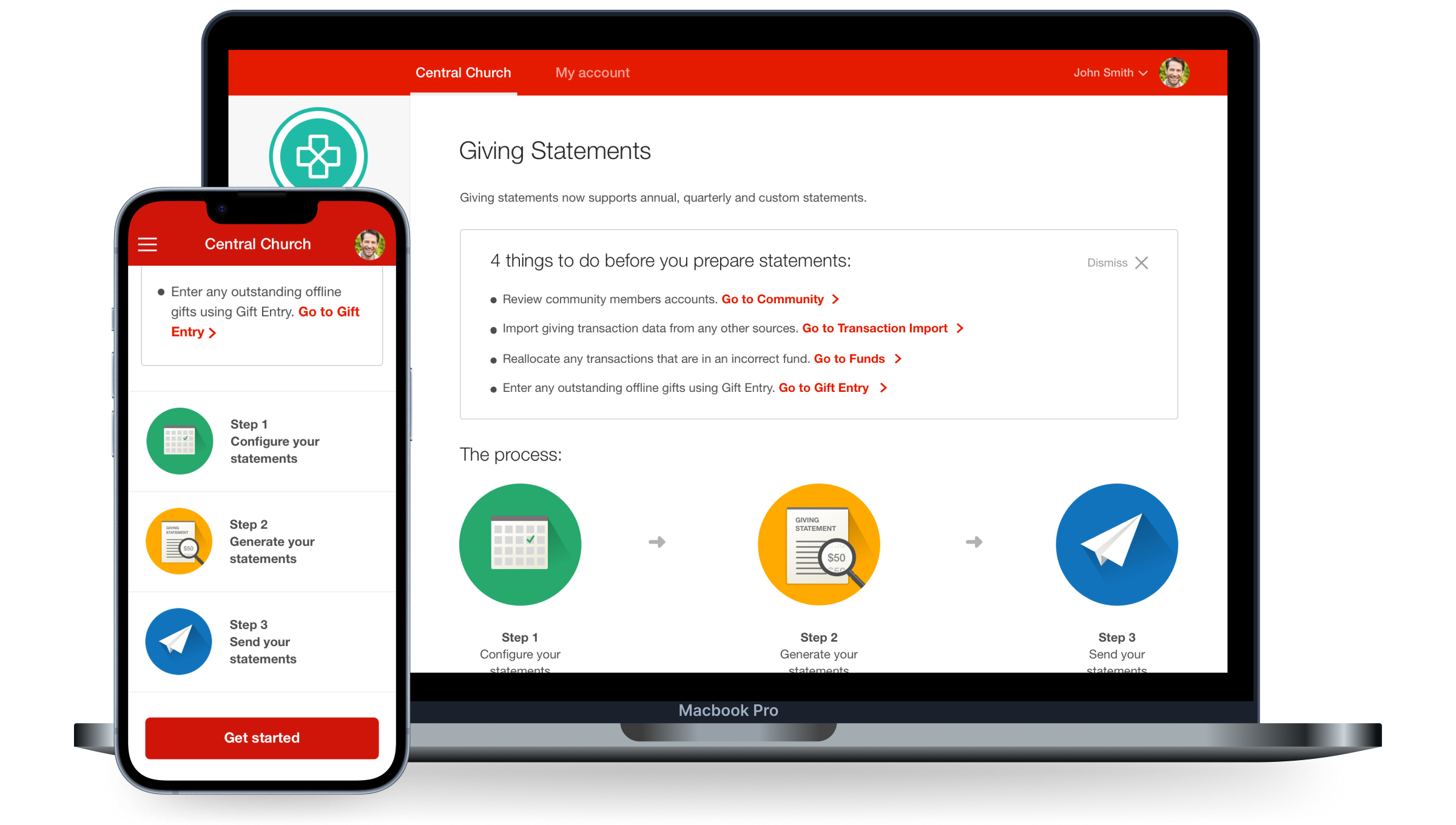
Pushpay's Giving Statements feature originally only allowed church admins to generate tax statements once a year. This meant church administrators were wasting time using third-party tools to generate statements more regularly, resulting in inaccurate financial information being sent out from Pushpay.
I was the lead designer for the interaction design and responsive UI and worked closely with a UX researcher who lead the user testing sessions whilst I observed and contributed notes in these sessions.
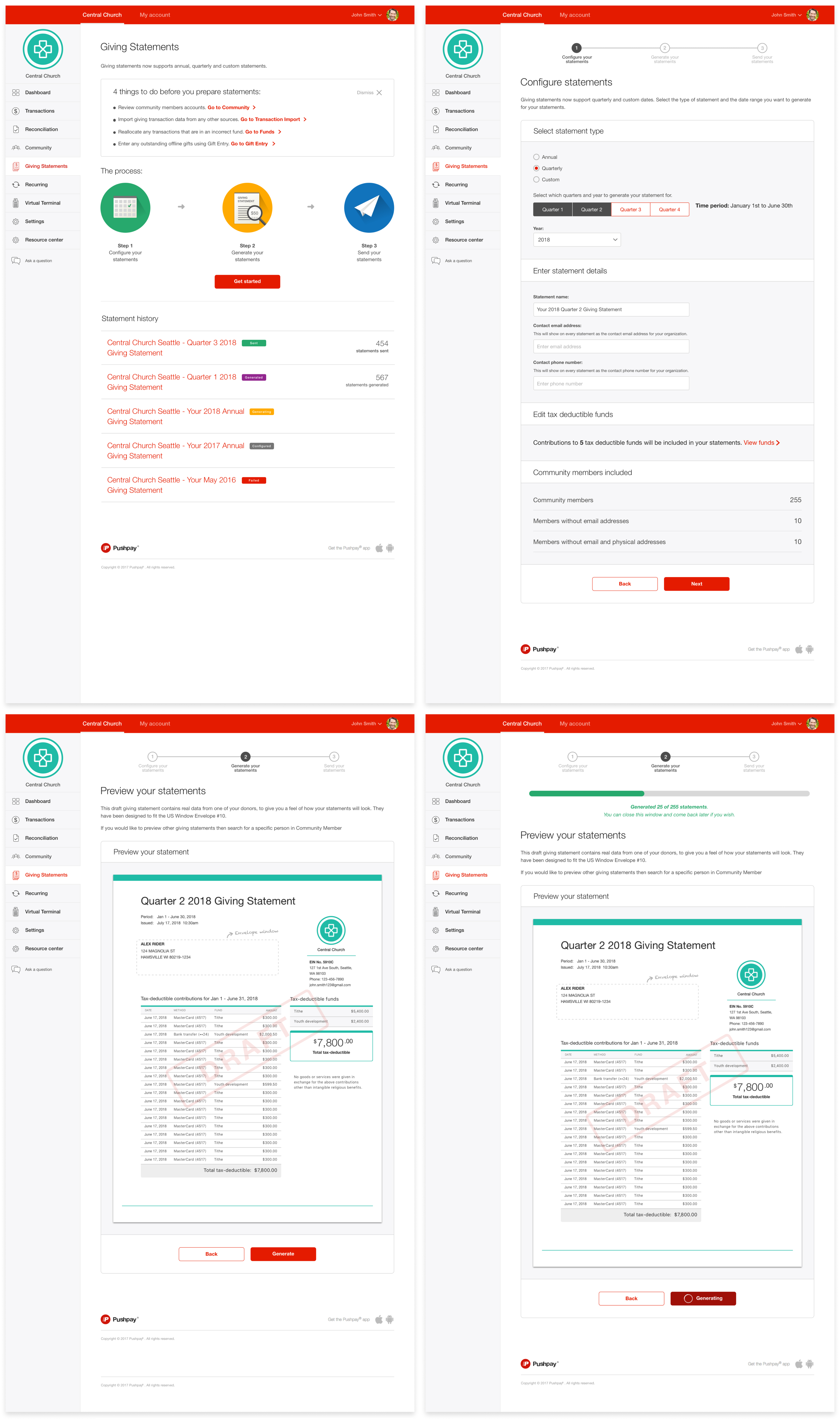
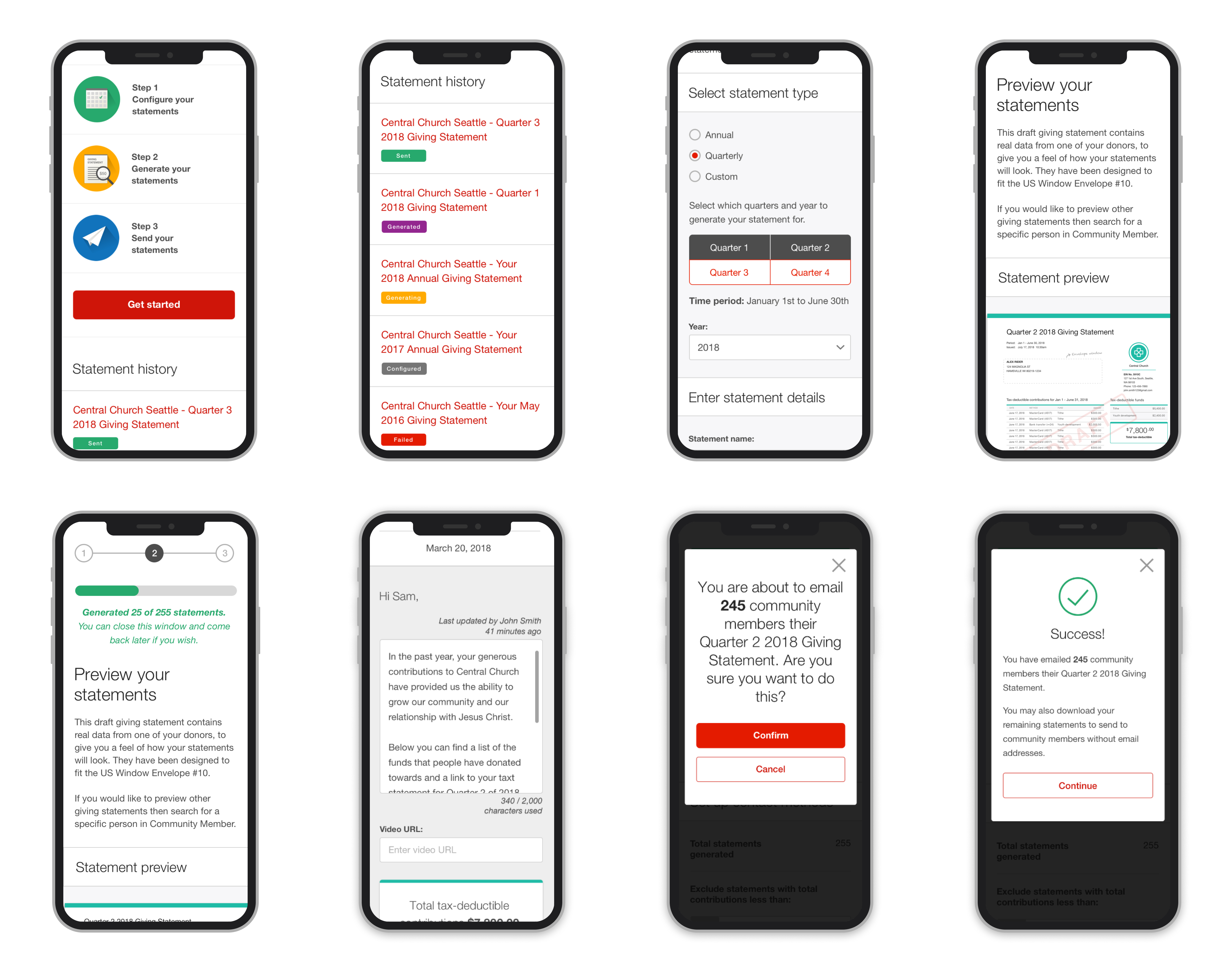
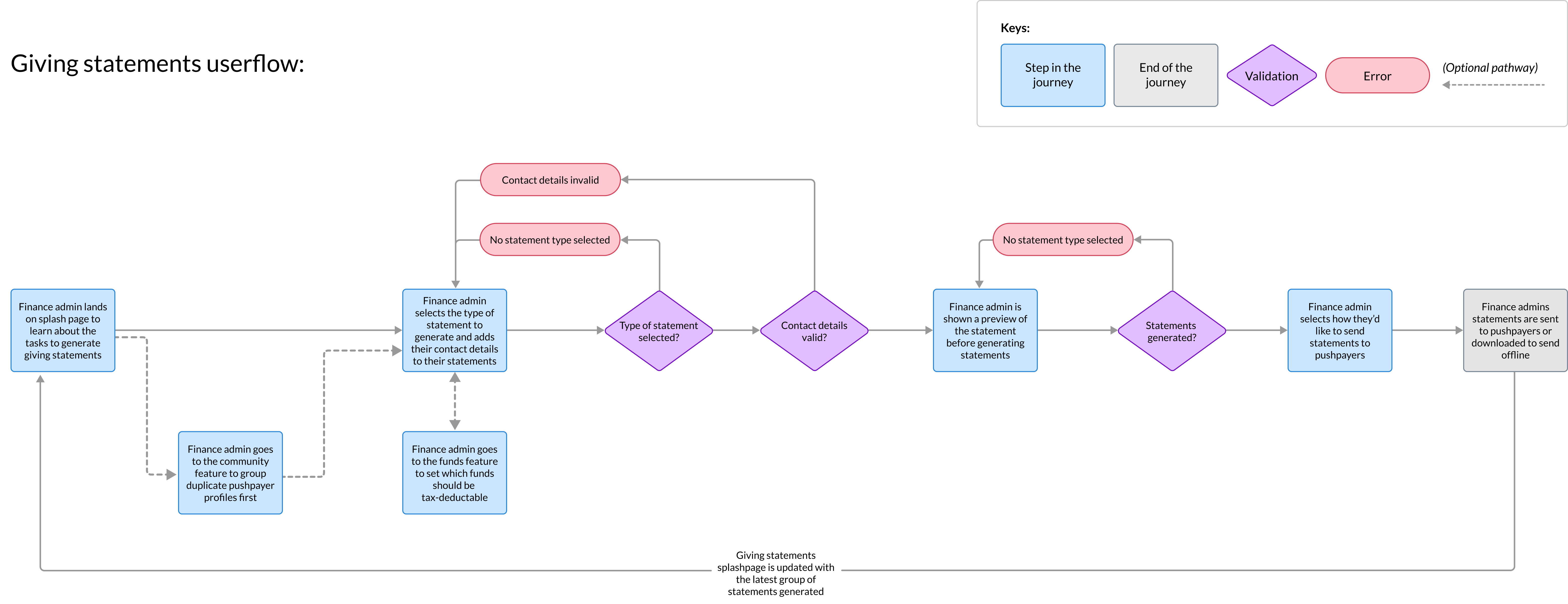
Userflow for Giving Statements
Originally the experience was 5 steps and had steps that could have been combined or were not essential to the tax statement generation experience.
I re-designed the experience down to be 3 steps. The two steps removed contained actions that didn't require their own pages and could be combined with other tasks to reduce setup time.
If I had been focusing on only re-designing the UI, then we would have missed the opportunity to simplify the experience's steps and reduce friction on a tedious process.
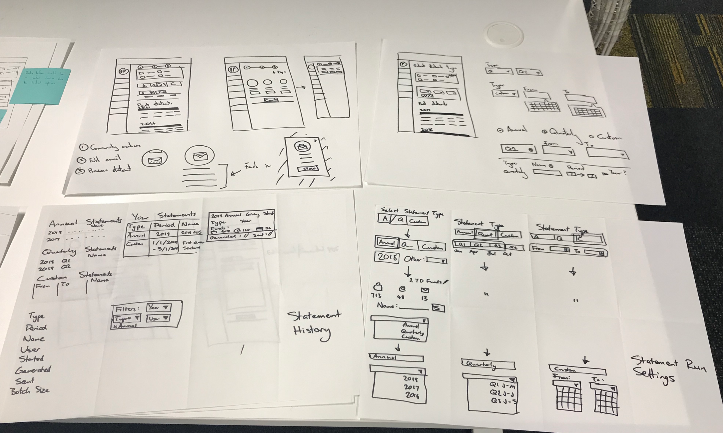
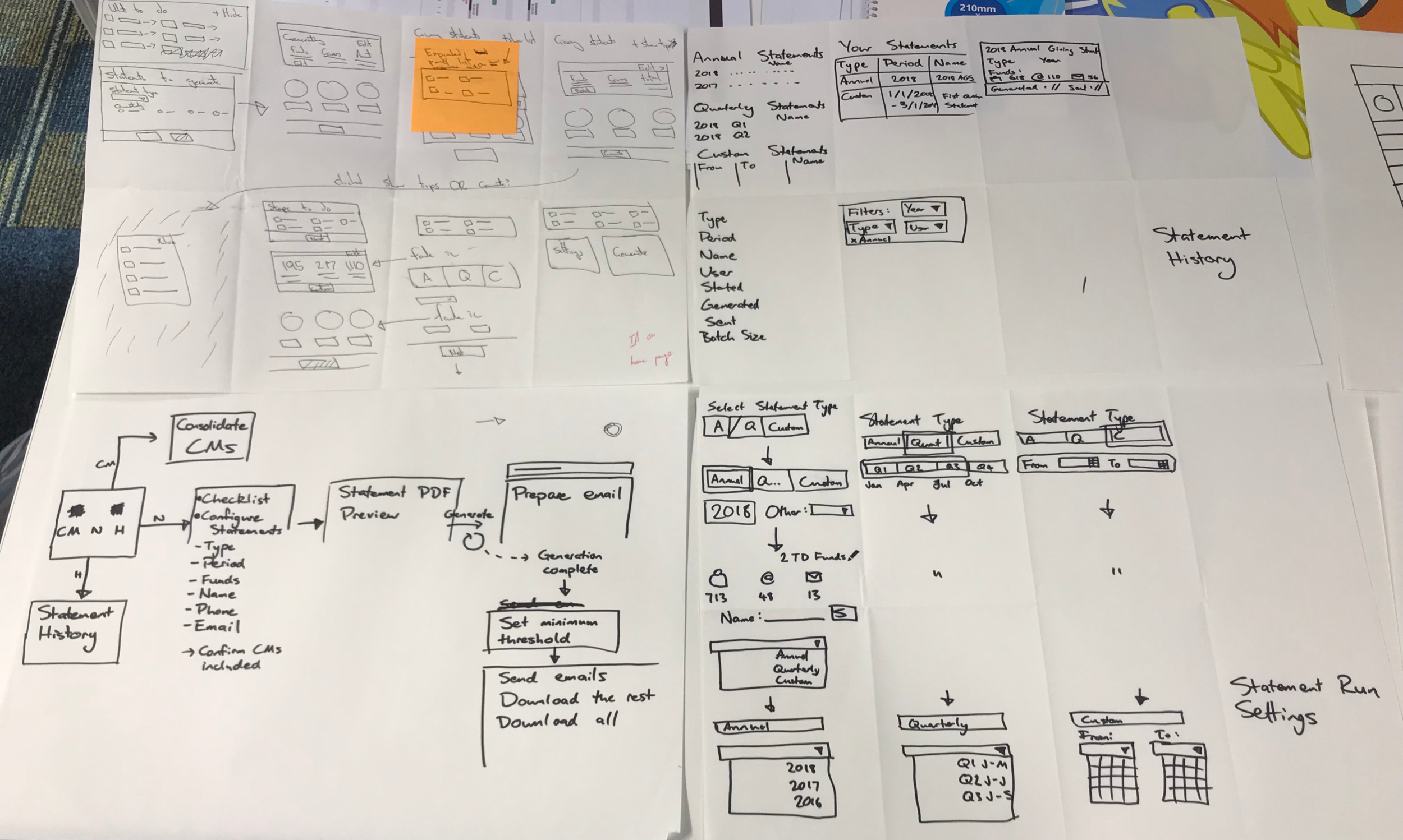
Ideation and Prototyping
I facilitated a co-design session with my team to generate low-fidelity ideas before moving into prototyping. From here I took the strongest ideas and formed a new prototype in UX Pin for testing.
From 5 rounds of testing, key trends we found included
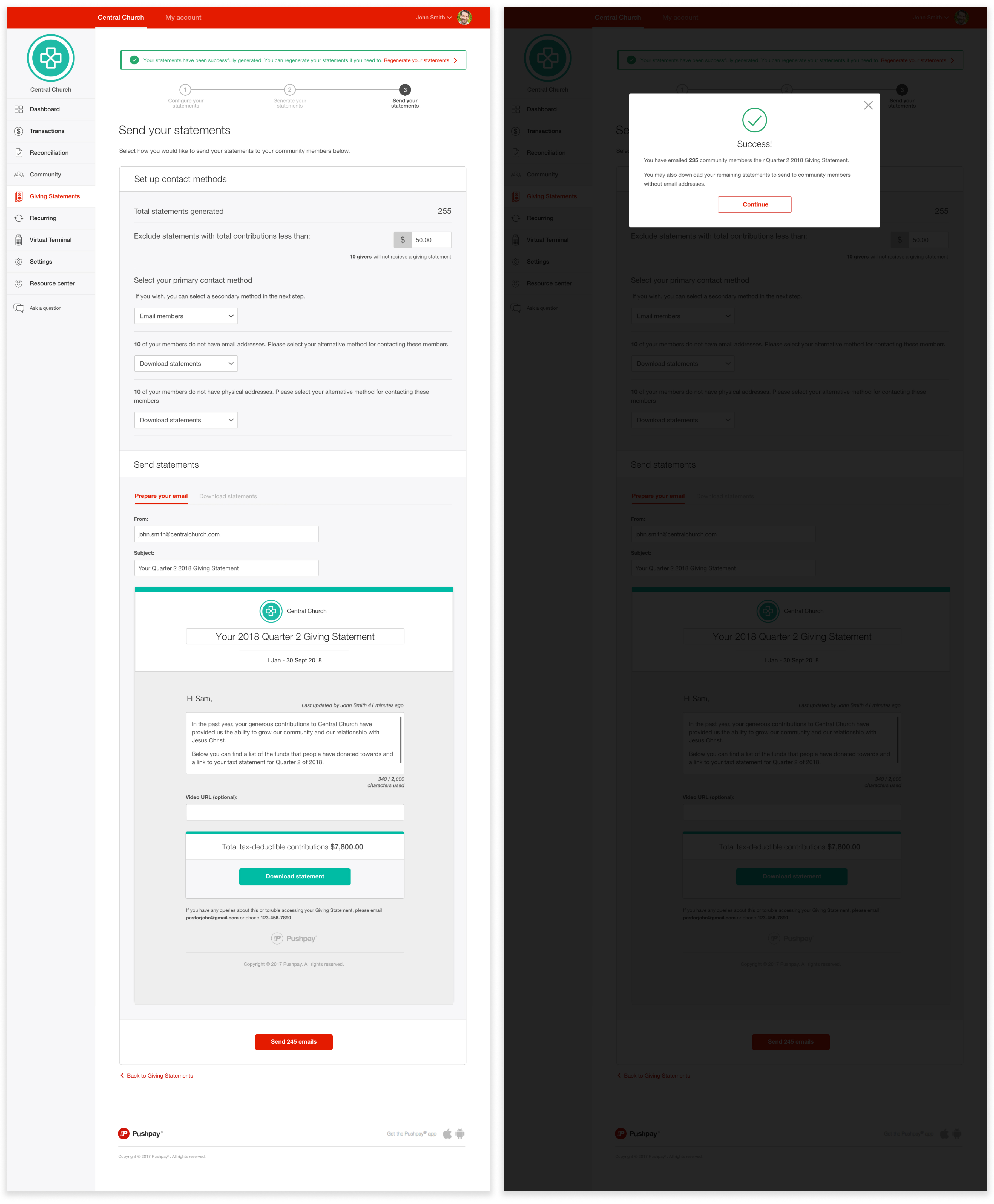
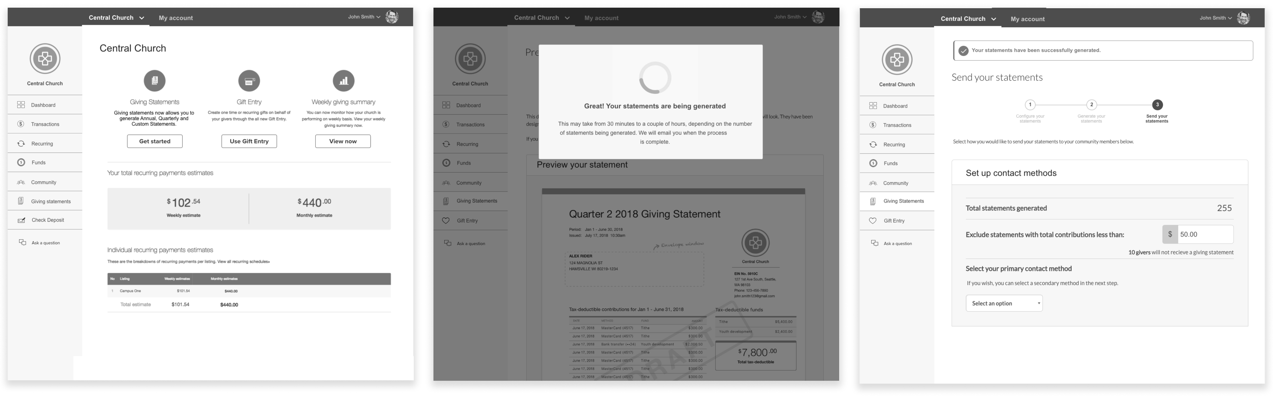
Participants wanted to be able to customise email content to make the messaging more personable. In our preview experience, we allowed users to customise wording.
Participants wanted to preview and download statements to verify word accuracy. We included a preview section in our experience before allowing users to generate statements
Our loading spinners gave no indication how long users had to wait until all statements are generated. We updated our final UI to be a progress bar that indicated how many statements needed to be generated before completion
Without user testing, we would not have found these key usability issues in our designs and risked not giving users the customisation flexibility they were wanting.
“ It’s definitely improved. Hands down this is much better, easier to manage and think through. I remember hesitating quite a bit with the other ”
- Accountants feedback from user testing
Refining our feature scope
The biggest challenge I faced was working within a fixed deadline. As we had told our customers in advance that we would have this feature in the market by the beginning of quarter 3, we had to cut back on certain requirements to ensure we met our deadline.
I collaborated with my product manager and aligned with these compromises to meet our deadline
We launched with email as the only communication method for the first release. Email was our most commonly used delivery method so we deferred SMS and physical mail to a later release
We removed the ability for users to send tax statements to church donors via the donator portal. From analytics, usage of the donator portal was low so we felt confident this could be deprioritised for later
Our mobile UI layout was released gradually overtime after the release as most of our users would do this task on desktop according to our internal analytics
Adding our success micro animation after release. We felt while it's a nice detail to make users feel more delightful after completing this task, it was a detail that shouldn't stop releasing the feature
Missing our Quarter 3 deadline would have meant breaking the announcement made to customers who were already planning their tax statement workflow around our release and risk affecting product reputation.
Outcome
150,000+
tax statements generated
30%
increase in feature usage
The feature was successfully launched on time to Pushpay’s customers on October 2018. Church admins provided positive feedback that the redesign saved time and reduced their reliance on third party tools